I dont care what logo just hurry up cus I'm waiting for new MX t-shirts!!

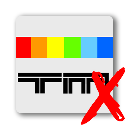
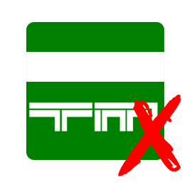
Ok, I admit I actually prefer the current logo. If fits better with the earth behind it. Imo the old X fits less because its asymmetrical.
One advise I have from the moment I saw the new logo. If you look close the new X its not perfectly symmetrical either. If someone could fix that then this logo is the best imo.
Im no photoshop artist but heres an example of what i mean. Maybe put a shadow on it and make it glow.
Ps I just ordered 2 more old logo TMX shirts.


\/


 Log in
 Trackmania² Exchange
 Shootmania Exchange
 TrackmaniaExchange
 Trackmania Original Exchange
 Trackmania Sunrise Exchange
 Trackmania Nations Exchange
 Trackmania United Forever Exchange
 Trackmania Nations Forever Exchange
 ItemExchange
 ManiaPark
 TMTube
 ManiaExchange Account
 ManiaExchange API
 Surely Retired
 Site Leader
 Old Age Caravanner


 Quad Bike Racer
  Learner Driver
