Hi everyone, I would like to achieve
three things with the MX logo
1) Retain some TMX heritage in the design
2) Be part of mania planet
3) Be also something independant from Nadeo / Ubi
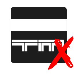
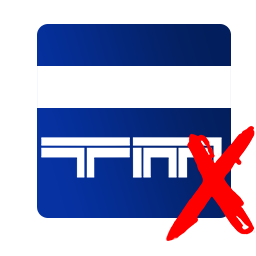
So the concept is to replace the current mania planet style 'X' with a
TMX style 'X', but keep the planet, a bit like this....
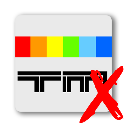
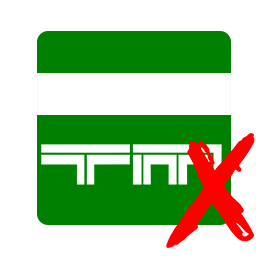
 Old on the left, new on the right.
However, as I'm not a skilled graphical artist, I would like to invite the community to come up with a logo based on the concept above, and then we can use it for mania-exchange.com.
Resources
Link to some old TMX logo files
Mania Planet logo files
TMX Logo and red X files
There is no other limitations, you can be as creative as you like, but the concept shown is the kind of idea we have at the moment, and we don't want to change from that unless your design really blows our ideas out of the water, so we would like you to keep the concept in mind really.

 Log in
 Trackmania² Exchange
 Shootmania Exchange
 TrackmaniaExchange
 Trackmania Original Exchange
 Trackmania Sunrise Exchange
 Trackmania Nations Exchange
 Trackmania United Forever Exchange
 Trackmania Nations Forever Exchange
 ItemExchange
 ManiaPark
 TMTube
 ManiaExchange Account
 ManiaExchange API
 Surely Retired
 Zimmer Racer
 Moped Racer
 Segmentation fault
 Quad Bike Racer
