

| Rethinking Mania Exchange - Improved Lists | 29 Oct, 2012 |
| Forzyy | (11 comments, 2669 views) |
|
The traditional (and current) way of displaying tracks is in a list format. Row by row, you're presented with information about a track or map. While simple and convenient, the amount of information presented is confined to a small space on the page. This results in possible trimmings of map names and user names, and other information of vast importance being left out.
Over time I've tried to improve list readability from TMX to MX. Changing the icons, adding an improved screenshot hover and a row highlight. Current 
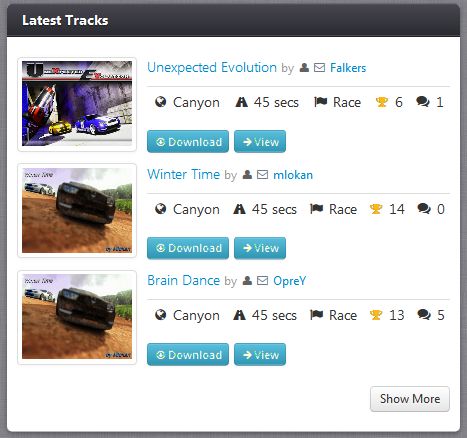
Let's replace that list with a much more beautiful list that isn't confined to a small space on the page. Next 
|
|
| tcq writes ... | 01, Nov, 2012 |
haenry says: This exactly what I'm aiming at. The page can't afford to get slower. If you find a way to display more information without make the page slower, go for it. Then I'm open for everything 
And as haenry already said, if there would be a possibility to display the different styles of the maps, then it would be even more awesome. But one other thing about the styles, why is it not possible to select multilap and that it is a tech multilap? If you simply say multilap it could be anythig (nascar, fullspeed, tech). Maybe do some fine tuning here? |
|
| haenry writes ... | 01, Nov, 2012 |
|
Not really sure, what I shall think about the new idea.
It is more appealing, of course! But it's sooo much bigger and also slower. I am really not sure, if I want such a loss of speed, just for a more appealing tracklist because the new idea of the tracklist does not really give you some very important extra informations about the track. (Just the screenshot, which you can see by howevering over anyways) It is really important for me, that the browsing through the track lists stays fast! What I really would prefer are some additional informations. Like the ingame screenshot tcq suggested! It would be really nice to see the ingame screenshot of every track, even if it has a slef-made screenshot (not necessarily in the tracklist, but on trackpage) The suggestion to show the tags of a track in the list, is also a good one! (like "fullspeed", "speedtech" or "tech") Maybe you can even let the author create an own tag, with a maximum of around 20 letters, which will be displayed in the tracklist. This own tag would give you more individual informations! |
|
| Mikey writes ... | 30, Oct, 2012 |
|
I prefer the |
|
| tcq writes ... | 30, Oct, 2012 |
|
I don't like the new idea, out of the same reason that Hans Holo posted.
At the moment the site gives you all information needed, while still being fast and easy to look at. Hans Holo says: And the second point is, what I fear for. Are maps going to upload their in-game picture, if no screen shot is provided? I mean, most people don't even know how to set the camera of this in-game picture or do obviously do not care about it. Hans Holo says: I would really plead for a version of MX, where the user can decide to load the old page (because it's faster) and for other people, to load the new fancy site. What about this idea? Use the old track list as the standard, but give a button to expand this list. The expanded one can then be the new fancy one and you can toggle between both of them? Players can set in their account settings how they wish the site to be displayed (with the toggle button, always the old style, always the new style). Another idea would be, what about the md scrolling idea? Only take the pictures of the maps, place the symbols for "award, uploaded replay" on it (indicate the amount of replays, awards by changes in the symbol size). If you want to get additional information, simply create a mouse over that displays them (author name, track name, WR, amount of awards and replays, comments). If you click the picture, you get redirected to the track page. |
|
| Forzyy writes ... | 30, Oct, 2012 |
Thanks guys. The feedback is much appreciated! 
Very nice md! I've got something similar in mind to keep the home page small. 
Alcator: it's been suggested before to add 'selectable features' to a track and it's definitely something worth doing. Just imagine how much better the search engine would be! 
... says: The classic map types are physically embedded within the system. I never engineered the site with the intention of title packs in mind. It's slowly getting there and definitely will. 
... says: I will consider these changes for the next update! Thank you Spider. 
|
|
| SPIDER writes ... | 30, Oct, 2012 |
Nice i like it.  but i have someething to say, as allways but i have someething to say, as allways 
Maybe add : how many replay each track have. Add the AT time if possible, and the track length should be after the AT "auto" so we can sort a tracks after the at "not the length" (at = length) <35 sec (Then we know the track is less than 35 and not 45, and Yeah,, i agree: add the "in file screenshoot" so we don´t get empty screens. 
btw i like the new "no screenshot" picture. 
|
|
| Nesrally writes ... | 30, Oct, 2012 |
I wholeheartedly support and welcome ur idea Forzyy. It just looks more modern and up to date..... 
|
|
| md writes ... | 29, Oct, 2012 |
|
i like it. looks so much better, without giving up the tyipical clean and sober style of tmx.
the only negative side i can think of right now, would be the extreme length of the homepage due to the fact that a box like ''10 newest tracks'' would be like 3-4 times longer than it is now. and it's going to be the same for every other box as well. one solution could be reducing the number of tracks 'advertized', but i don't think it would be a good idea. maybe some kind of horizontal scolling can help here: 
|
|
| Falkers writes ... | 29, Oct, 2012 |
I have to agree it's a much more beautiful list, unsure about the negatives but for me it looks much better then the current list 
|
|
| Alcator writes ... | 29, Oct, 2012 |
|
The problem with trackname trimming is a big one; other than that, I'd recommend checking which information people WANT to see about the track, rather than thinking about how to place ALL the information right in front of visitor's eyes.
Also, I noticed that "Platform" was missing from the list of track types last time I uploaded a Platform track (in August). I wonder if it would be possible to allow builders to select let's say 3-5 TAGS for their tracks when they upload them. Eg. "Respawnable", "Error-tolerant", "Curves/Slides" or, on the other hand: "Fullspeed", "No respawns", "No-slide" And these would be shown in the track list. |
|
| Hans Holo writes ... | 29, Oct, 2012 |
|
I don't have any opinion on that, but there are to things coming to my mind:
- wouldn't it take too long to load 60 pictures when visiting MX. I prefer an ugly site (which MX isn't), to a slow site. - most of the tracks do not have a screenshot, so there will be a lot of "blank" pictures at the top of the page. Maybe you could solve this like on TMXNF, with the second screenshot, that gets somehow exctracted from the file. (Then you would have crappy pictures instead of blanks.) Hans 
|
|